Poverty
Global poverty is one of the most pressing problems that the world faces today. The poorest in the world are often undernourished and without access to basic services such as electricity and safe drinking water; they have less access to education and suffer from much poorer health.
In order to make progress against such poverty in the future, we need to understand poverty around the world today and how it has changed.
On this page you can find all our data, visualizations and writing relating to poverty. This work aims to help you understand the scale of the problem today; where progress has been achieved and where it has not; what can be done to make progress against poverty in the future; and the methods behind the data on which this knowledge is based.
Key Insights on Poverty
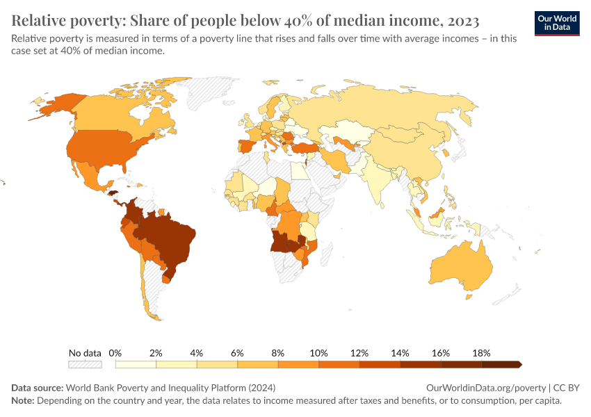
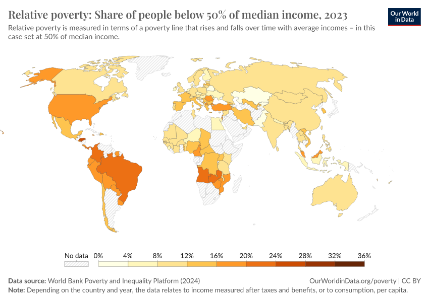
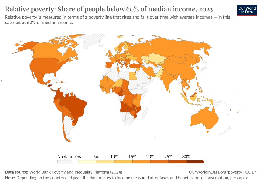
Measuring global poverty in an unequal world
There is no single definition of poverty. Our understanding of the extent of poverty and how it is changing depends on which definition we have in mind.
In particular, richer and poorer countries set very different poverty lines in order to measure poverty in a way that is informative and relevant to the level of incomes of their citizens.
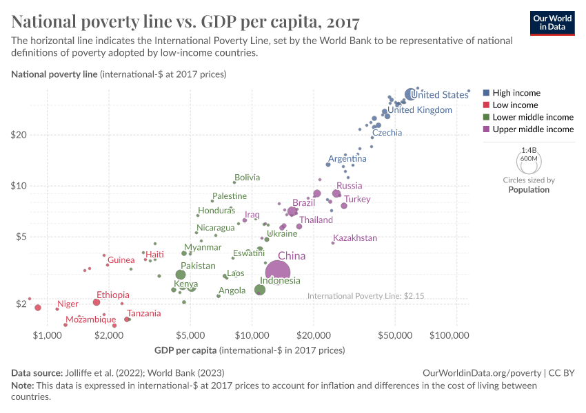
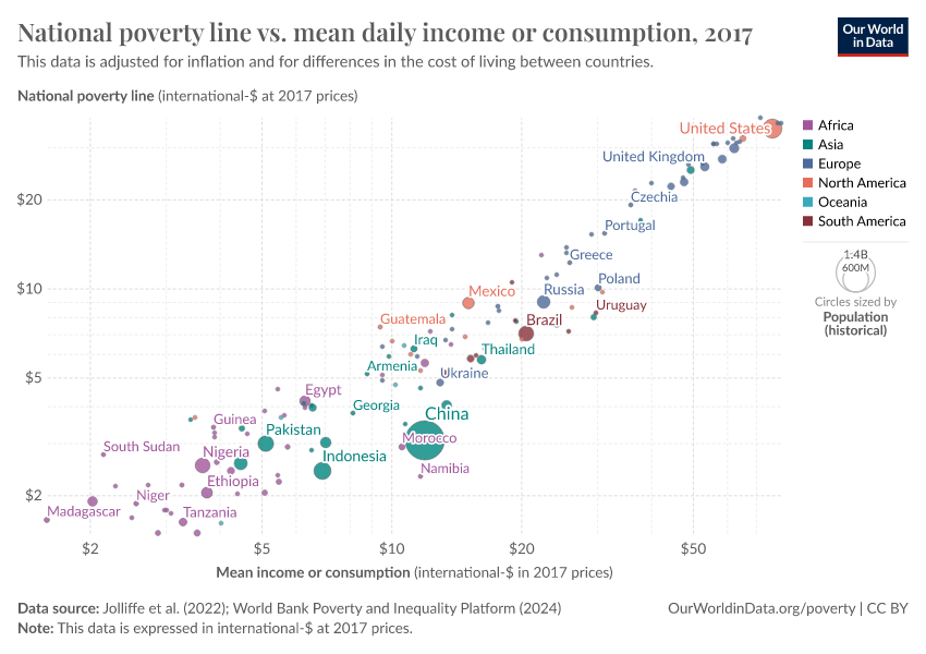
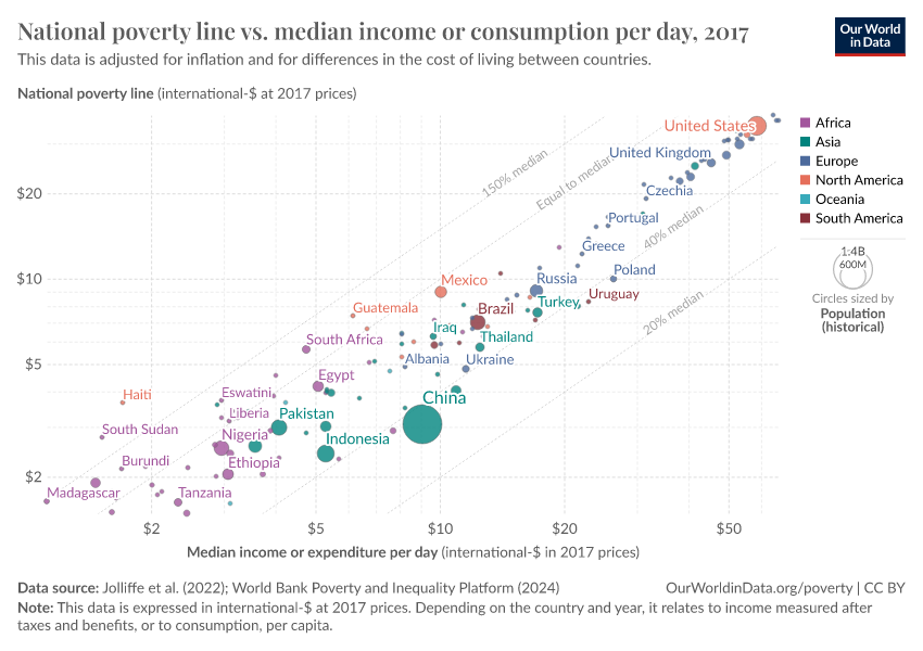
For instance, while a person in the United States is counted as being in poverty if they live on less than $27.10 per day, in Ethiopia, the poverty line is set more than ten times lower — at $2.59 per day. You can explore national poverty lines and read more about how they are calculated in this footnote.1
Because the definition of poverty varies so widely, national poverty lines can’t be used to compare poverty across countries. To measure poverty globally, we need to use a poverty line that is applied consistently across all countries.
This is the goal of the International Poverty Line of $3 per day — shown in red in the chart — which is set by the World Bank and used by the UN to monitor extreme poverty around the world.
In global terms, we see that this is an extremely low threshold, set to represent the typical poverty lines adopted in the world’s poorest countries. It marks an incredibly low standard of living — a level of income much lower than just the cost of a healthy diet.
What you should know about this data
- Global poverty data relies on national household surveys that have differences affecting their comparability across countries or over time. In this chart, the data for the United States and Turkey relates to incomes, and the data for the other countries relates to consumption expenditure.2
- The poverty lines here are an approximation of national definitions of poverty, made in order to allow comparisons across the countries.1
- Non-market sources of income, including food grown by subsistence farmers for their own consumption, are taken into account.3
- Data is expressed in international-$ at 2021 prices, which means that inflation and differences in living costs across countries are taken into account.4
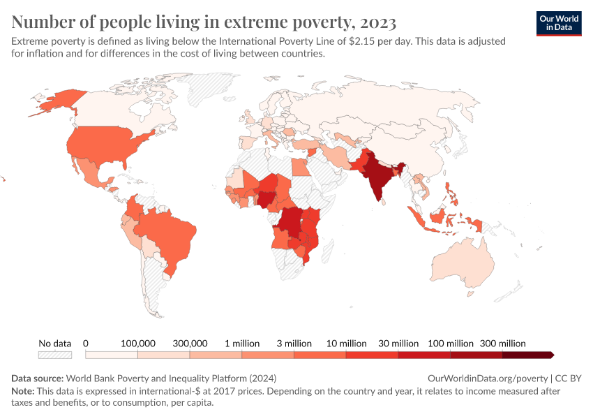
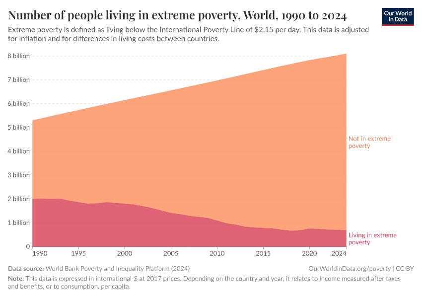
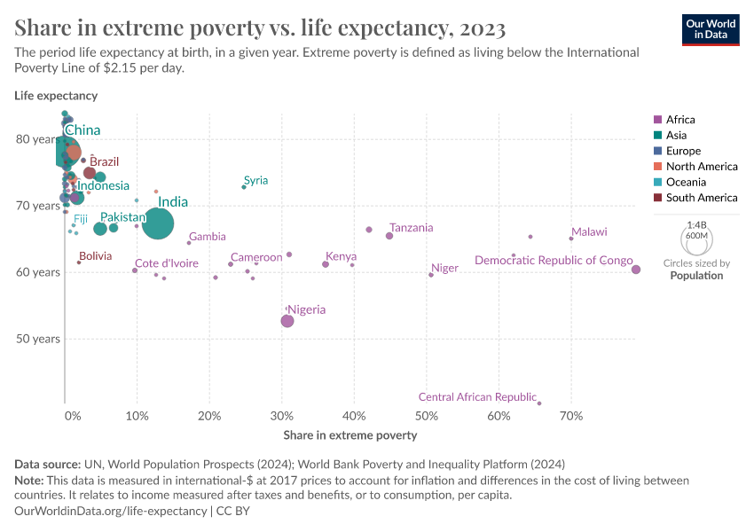
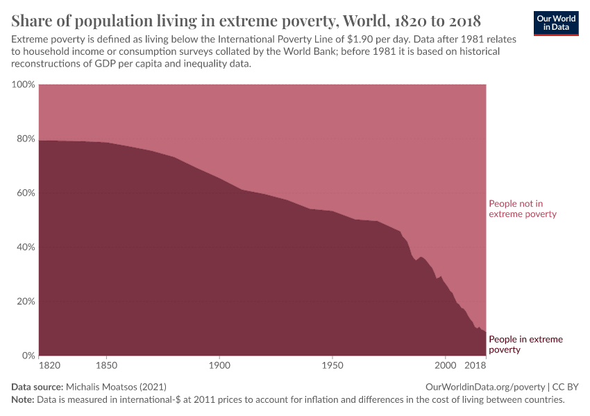
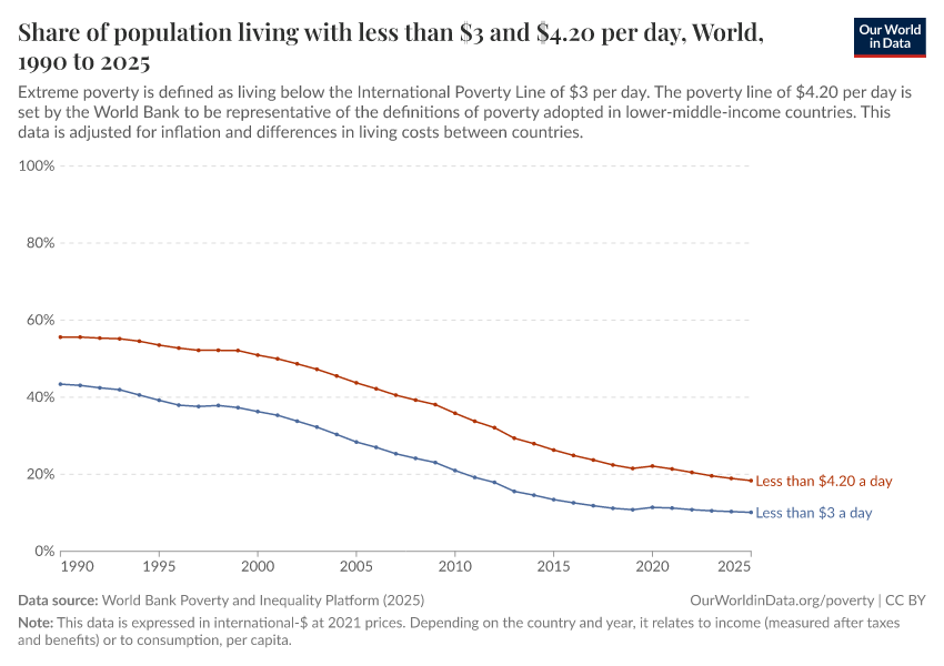
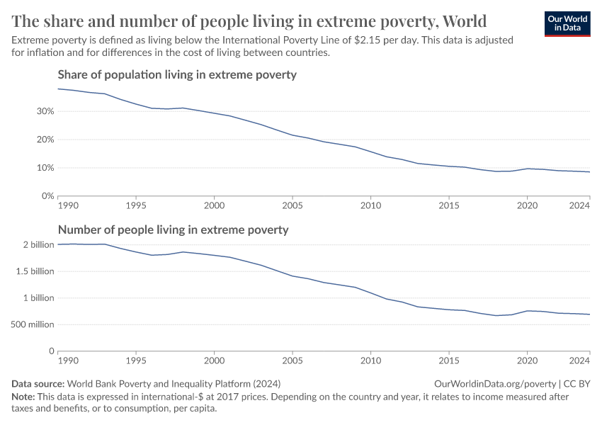
Global extreme poverty declined substantially over the last generation
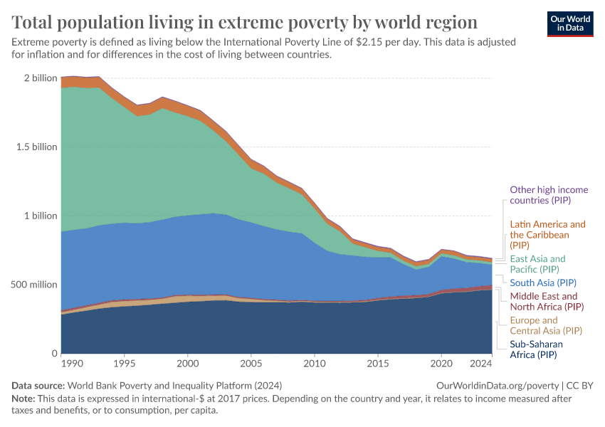
Extreme poverty has declined hugely over the past generation. This is one of the most important ways our world has changed over this time.
Today, there are more than 1.5 billion fewer people living below the International Poverty Line of $3 per day than in 1990. This means, on average, that the number declined by about 42.9 million per year, or about 118,000 people every day over these 35 years.5
The COVID-19 pandemic had a terrible impact on the world’s poorest. According to the World Bank, the number of people in extreme poverty increased by around 50 million between 2019 and 2020, marking the first substantial rise in a generation. Since 2020, progress in reducing extreme poverty has resumed, but at a slower pace than before.
The scale of global poverty today remains vast. The latest global estimates for 2025 show that around 800 million people are in extreme poverty. This means that roughly one in ten people are living on less than $3 a day.
What you should know about this data
- Extreme poverty here is defined according to the UN’s definition of living on less than $3 a day — an extremely low threshold needed to monitor and draw attention to the living conditions of the poorest around the world. Read more in our article, The $3 a day International Poverty Line.
- Global poverty data relies on national household surveys that have differences affecting their comparability across countries or over time.2
- Non-market sources of income, including food grown by subsistence farmers for their own consumption, are taken into account.3
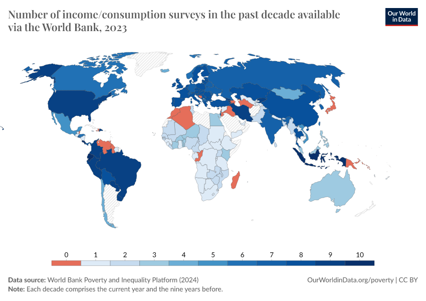
- Surveys are less frequently available in poorer countries and for earlier decades. To produce regional and global poverty estimates, the World Bank collates the closest survey for each country and projects the data forward or backward to the year being estimated.6
- Global estimates rely on coverage rules to determine whether a country has recent survey data that can be used for meaningful regional and global figures. Typically, a country is considered to have sufficient data if it has a survey conducted within three years of the reference year. During the COVID-19 pandemic, coverage rules had to be adjusted. Estimates in 2020, 2021, and 2022 do not consider surveys before 2020. Analogously, estimates in 2017, 2018, and 2019 do not consider surveys from 2020 and after.
- Data is expressed in international-$ at 2021 prices, which means that inflation and differences in living costs across countries are taken into account.4

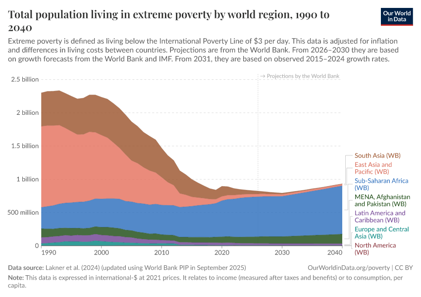
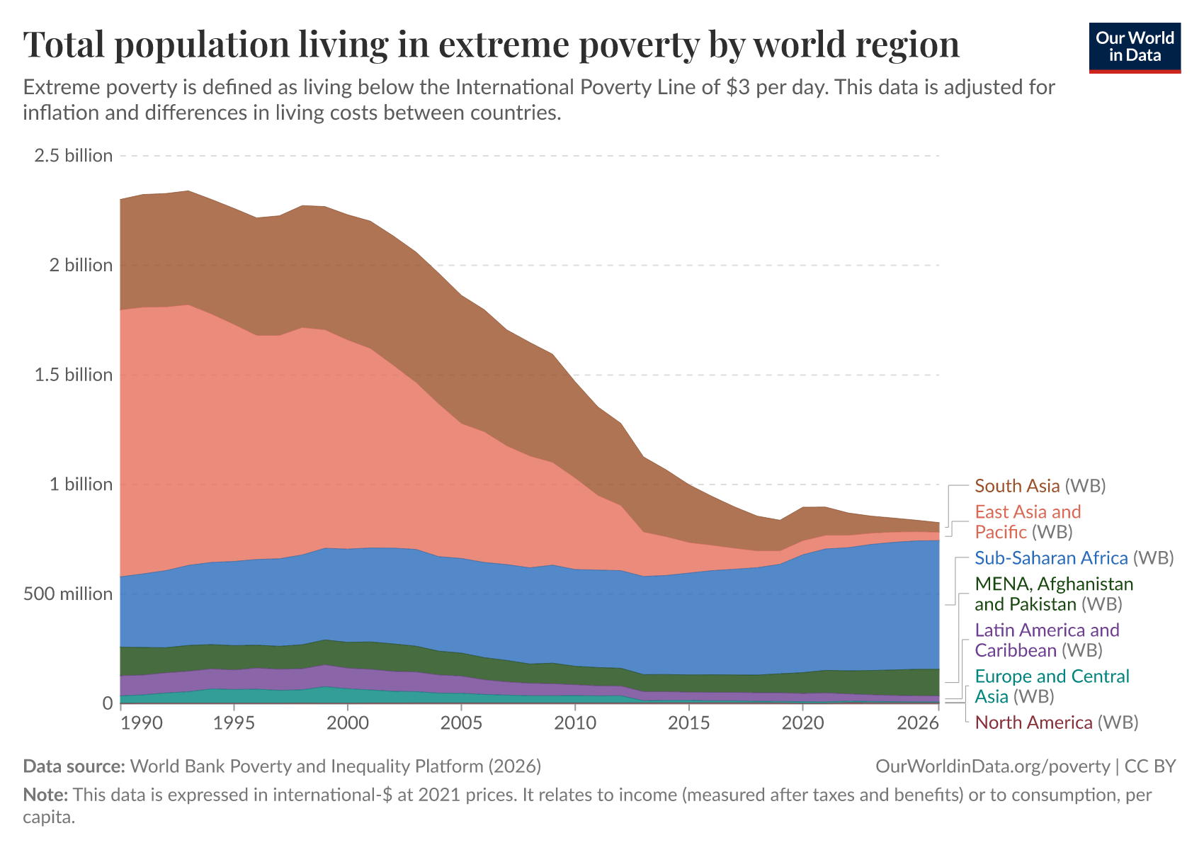
Hundreds of millions will remain in extreme poverty on current trends
Extreme poverty declined during the last generation because the majority of people living on the lowest incomes lived in countries that experienced strong economic growth, particularly in Asia.
Today, most people living in extreme poverty are in Sub-Saharan Africa, where weak economic growth and high population growth in many countries have led to a rising number of people living in extreme poverty.
The chart shows the number of people in extreme poverty, with projections until 2030 produced by World Bank researchers based on economic growth forecasts.7
A very bleak future is ahead of us should such weak economic growth in the world’s poorest countries continue — a future in which extreme poverty is the reality for hundreds of millions for many years to come.
What you should know about this data
- Extreme poverty here is defined according to the UN’s definition of living on less than $3 a day — an extremely low threshold needed to monitor and draw attention to the living conditions of the poorest around the world. Read more in our article, The $3 a day International Poverty Line.
- Global poverty data relies on national household surveys that have differences affecting their comparability across countries or over time.2
- The extreme poverty preliminary estimates (“nowcasts”) for 2024 and 2025 and projections until 2030 are based on research by Lakner et al. (2025).8
- Non-market sources of income, including food grown by subsistence farmers for their own consumption, are taken into account.3
- Surveys are less frequently available in poorer countries and for earlier decades. To produce regional and global poverty estimates, the World Bank collates the closest survey for each country and projects the data forward or backward to the year being estimated.6
- Data is expressed in international-$ at 2021 prices, which means that inflation and differences in living costs across countries are taken into account.4
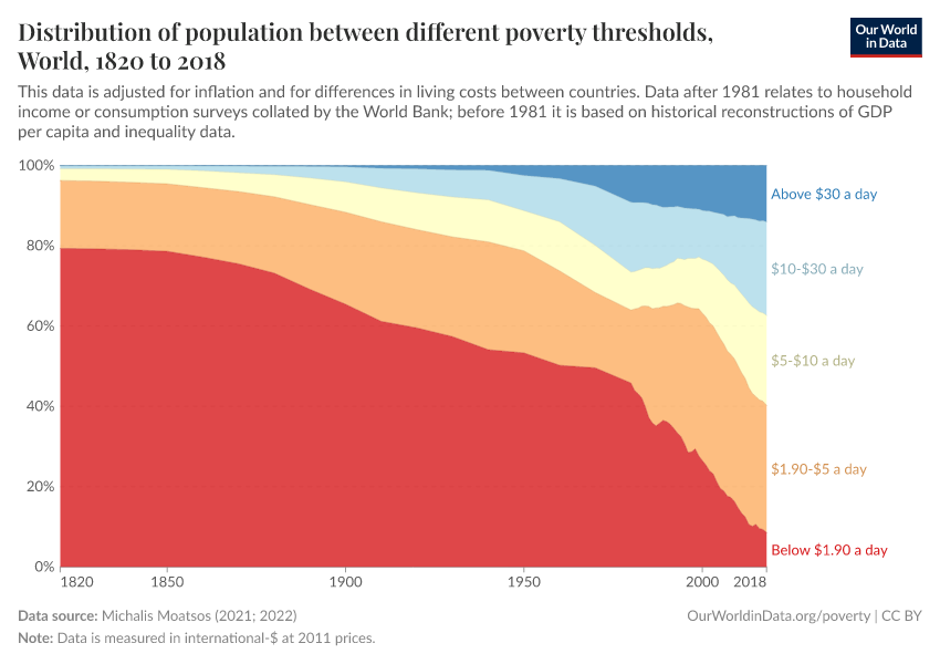
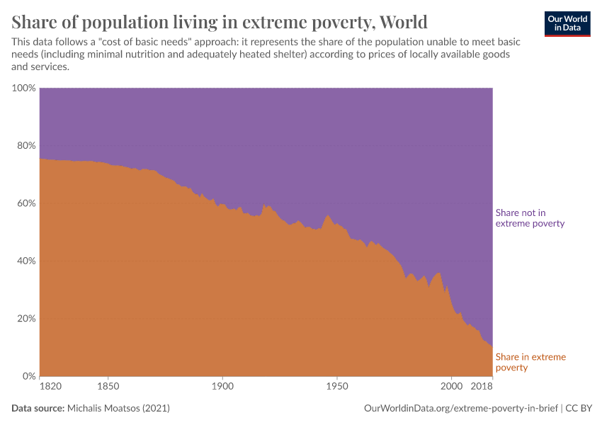
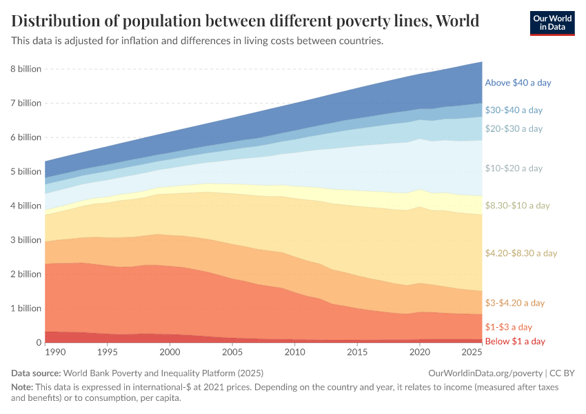
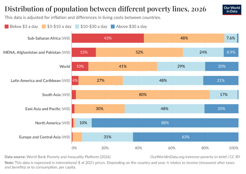
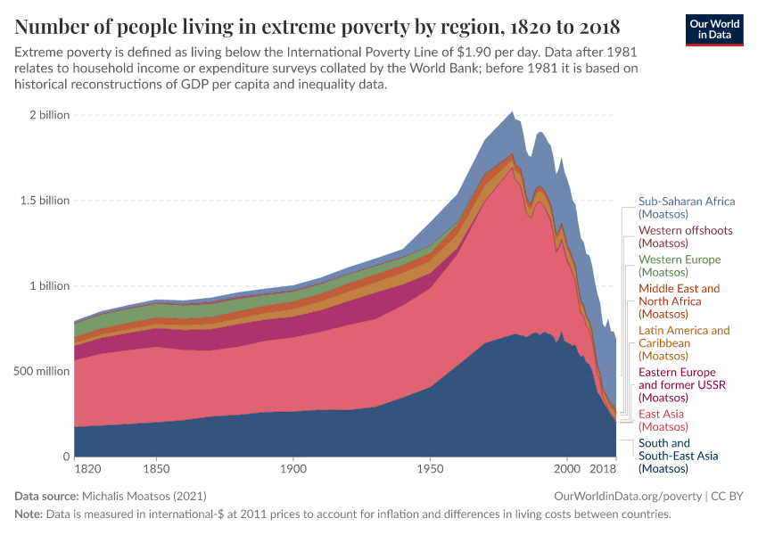
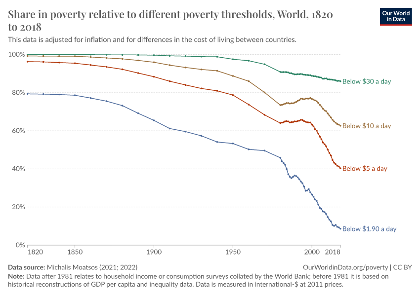
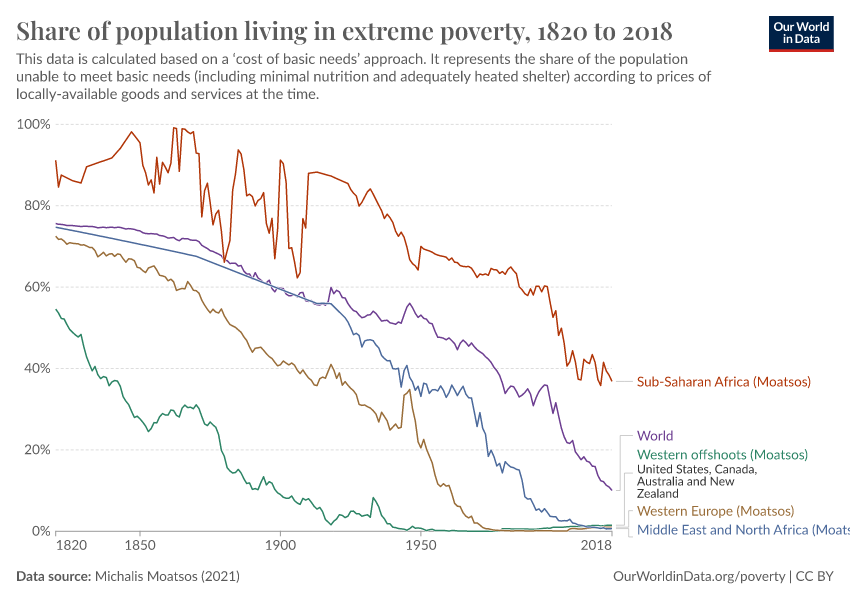
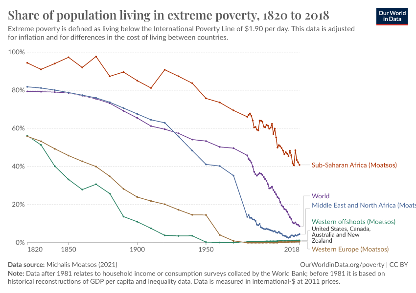
After 200 years of progress, the fight against global poverty is just beginning
Over the past two centuries, the world has made good progress against extreme poverty.
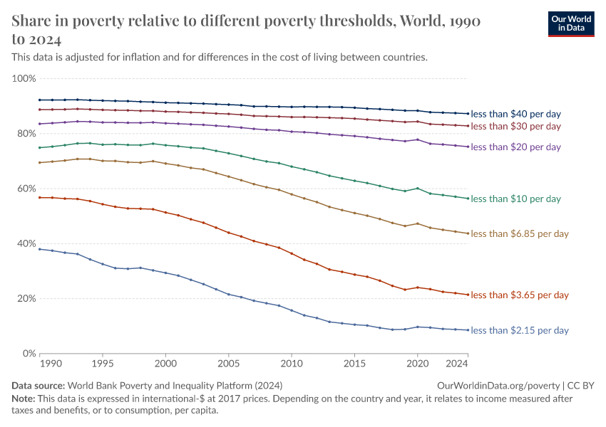
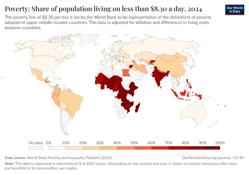
But only very recently has poverty fallen at higher poverty lines. Global poverty rates at these higher lines remain very high:
- Around a quarter — 24% — of the world lives on less than $5 a day.
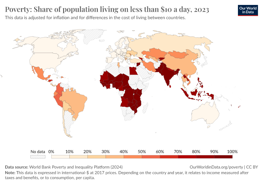
- Around half — 52% — of the world lives on less than $10 a day.
- 81% live on less than $30 a day — a threshold similar to the poverty lines adopted in many of the world’s richest countries.10
Economic growth has allowed most of the world to leave extreme poverty behind. But by the standards of today’s rich countries, the world remains very poor. If this should change, the world still needs to achieve very substantial economic growth.
What you should know about this data
- The data from 1981 onwards is based on household surveys collated by the World Bank. Earlier figures are from Moatsos (2021), who extends the series backward using historical reconstructions of GDP per capita and inequality data.11
- All data is expressed in international-$, which means that inflation and differences in living costs across countries are taken into account.4
- The World Bank data is expressed in international-$ at 2021 prices. The World Bank has updated its methodology, having previously used 2017 and 2011 international-$ to measure incomes and set poverty lines. The Moatsos (2021) historical series is based on the previously used World Bank definition of extreme poverty — living on less than $1.90 a day when measured in 2011 international-$. You can read more about the updates to the World Bank’s methodology and how it has affected its estimates of poverty in our articles From $1.90 to $2.15 a day: the updated International Poverty Line and The $3 a day International Poverty Line.
- The World Bank data relies on national household surveys that have differences affecting their comparability across countries or over time.2
- Such household surveys are less frequently available in poorer countries and for earlier decades. To produce regional and global poverty estimates, the World Bank selects the closest survey for each country and projects the data forward or backward to the year being estimated.6
- Non-market sources of income, including food grown by subsistence farmers for their own consumption, are taken into account. This is also true of the historical data — in producing historical estimates of GDP per capita on which these long-run estimates are based, economic historians include such non-market sources of income, as we discuss in our article How do we know the history of extreme poverty?
Research & Writing
November 17, 2025
The end of progress against extreme poverty?
In the last three decades, the world has made progress against extreme poverty faster than ever before. But unless the poorest economies start growing, this period of progress against the worst form of poverty is over.
August 11, 2025
$3 a day: A new poverty line has shifted the World Bank’s data on extreme poverty. What changed, and why?
In June 2025, the World Bank increased its extreme poverty estimates by 125 million people. This doesn’t mean the world has gotten poorer: it reflects a new, higher International Poverty Line of $3 a day, up from $2.15.
December 16, 2024
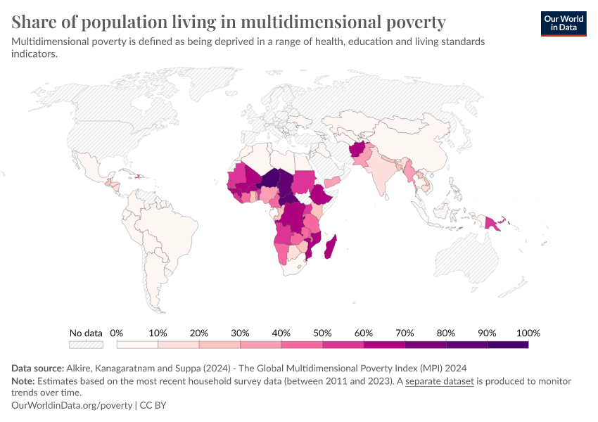
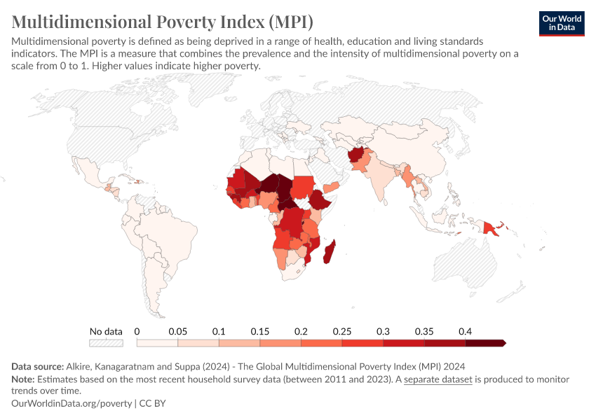
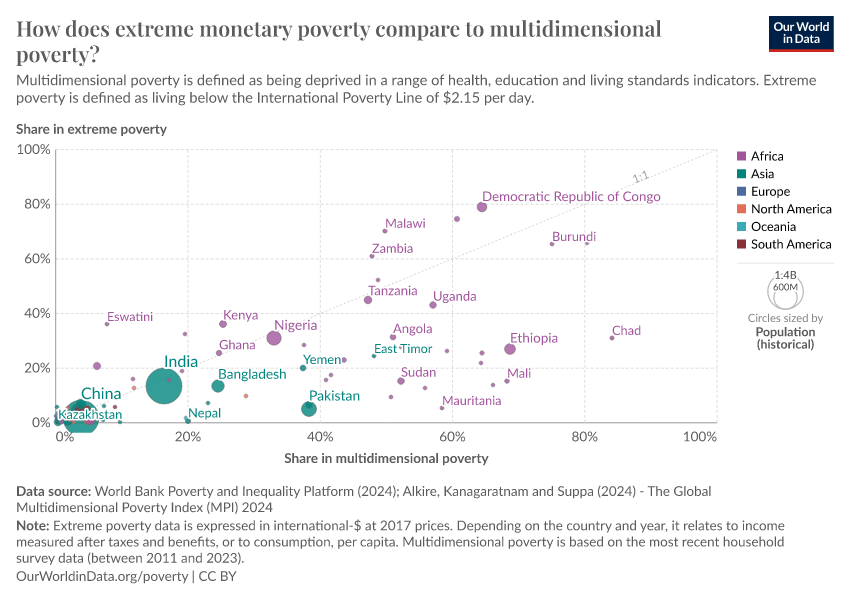
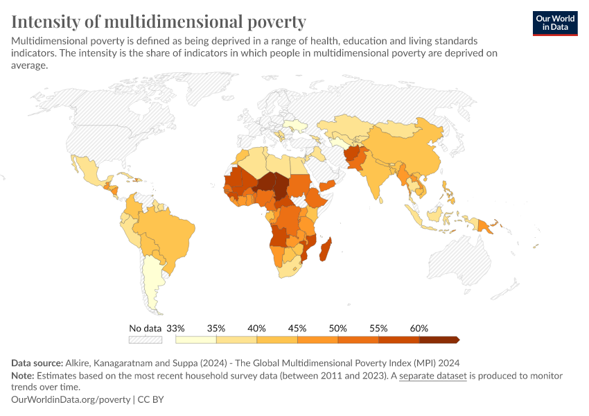
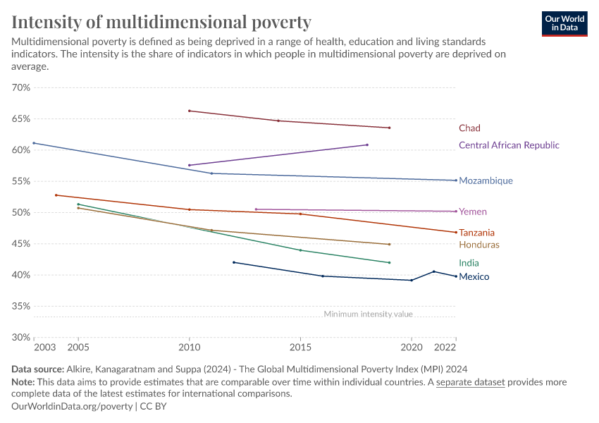
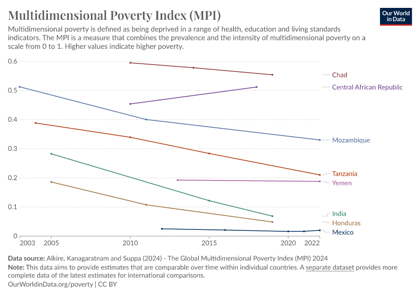
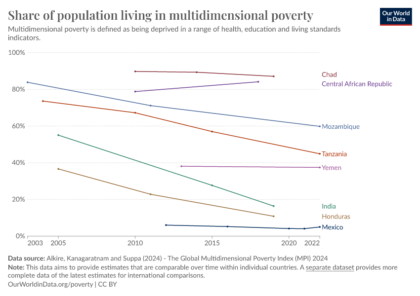
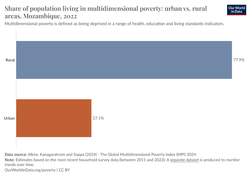
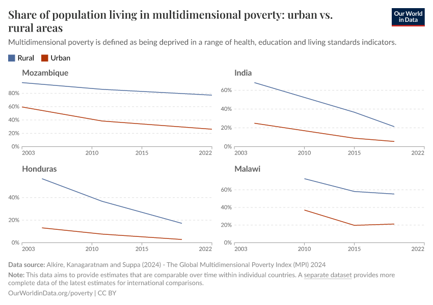
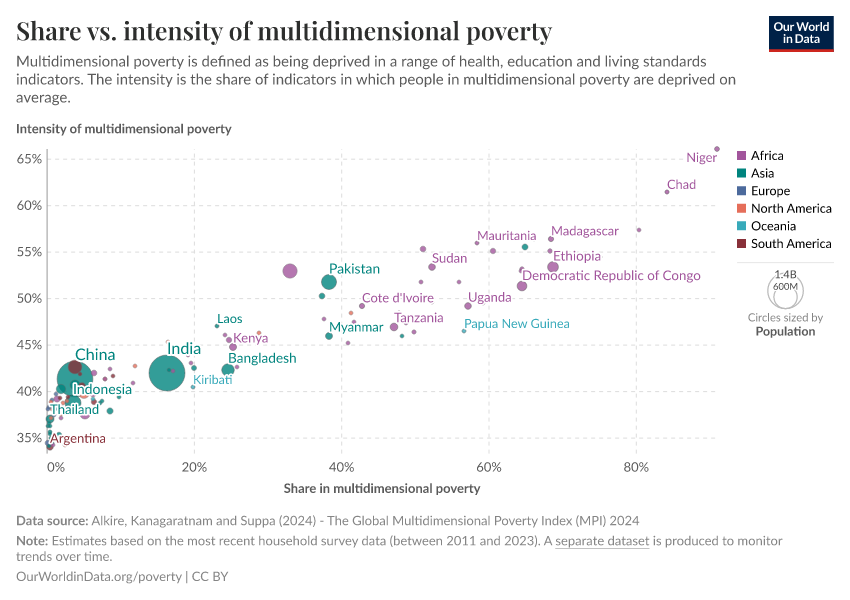
Beyond income: understanding poverty through the Multidimensional Poverty Index
The experience of poverty goes beyond a very low income. What is the Multidimensional Poverty Index, and how does it capture the diverse ways people experience deprivation?
Global poverty over the long-run
January 11, 2022
The history of the end of poverty has just begun
February 5, 2019
How do we know the history of extreme poverty?
November 26, 2020
Breaking out of the Malthusian trap: How pandemics allow us to understand why our ancestors were stuck in poverty
December 14, 2016
The short history of global living conditions and why it matters that we know it
Poverty & Economic Growth
August 27, 2023
Extreme poverty: How far have we come, and how far do we still have to go?
February 22, 2021
The economies that are home to the poorest billions of people need to grow if we want global poverty to decline substantially
March 15, 2021
How much economic growth is necessary to reduce global poverty substantially?
March 5, 2021
Global poverty in an unequal world: Who is considered poor in a rich country? And what does this mean for our understanding of global poverty?
April 8, 2017
What do poor people think about poverty?
April 4, 2022
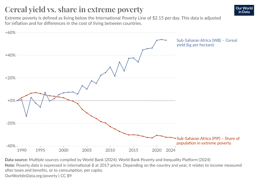
Increasing agricultural productivity across Sub-Saharan Africa is one of the most important problems this century
More Articles on Poverty
July 12, 2021
Almost three billion people cannot afford a healthy diet
February 23, 2017
Homelessness and poverty in rich countries
September 29, 2017
Historical poverty reductions: more than a story about “free-market capitalism”
July 6, 2023
OWID Data Collection: Inequality and Poverty
October 26, 2022
From $1.90 to $2.15 a day: the updated International Poverty Line
Key Charts on Poverty
See all charts on this topic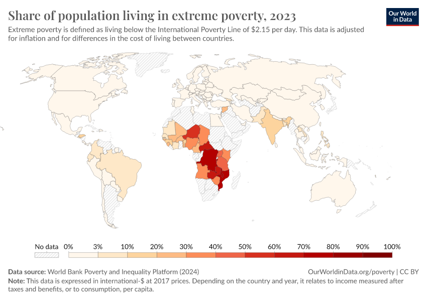


Featured Data on Poverty
Endnotes
Official definitions of poverty vary across countries and are often not directly comparable due to the different ways in which poverty is measured. For example, some countries measure it using household income, others use consumption, and there are differences in how they account for the size of households.
The poverty lines shown here are an approximation of those national definitions. To make comparisons possible, the World Bank built a database of harmonized national poverty lines. For all countries apart from the United States, we take the harmonized poverty line.
Harmonized poverty lines are calculated as the international dollar figure, which, when applied to the World Bank’s Poverty and Inequality Platform (PIP) data, yields the same poverty rate as each country’s officially reported rate in a given year (typically around 2021 in the latest 2025 PIP data release). This approach allows us to express the national poverty lines on a common scale, telling us how much someone would need to live on (in international dollars) to be considered poor by the standards of their own country. You can read more about the methodology in Joliffe et al. (2024) and Foster et al. (2025).
For the US, Foster and colleagues use the OECD’s published poverty rate — which is measured against a relative poverty line of 50% of the median income. This yields a poverty line of around $44 (measured using 2023 survey data). But this is not the official definition of poverty adopted in the US. We calculated an alternative harmonized figure for the US national poverty using the same method as Jolliffe et al. (2024), but based instead on the official 2023 poverty rate reported by the US Census Bureau.
Jolliffe, D., Mahler, D. G., Lakner, C., Atamanov, A., & Tetteh-Baah, S. K. (2024). Poverty and Prices: Assessing the Impact of the 2017 PPPs on the International Poverty Line and Global Poverty. The World Bank Economic Review, lhae035. Available here.
Foster, E.M., Jolliffe, D., Ibarra, G.L., Lakner, C., Tetteh Baah, S.K. (2025). Global Poverty Revisited Using 2021 PPPs and New Data on Consumption. Policy Research Working Paper. World Bank, Washington, D.C. Available here.
Because there is no global survey of incomes, researchers need to rely on available national surveys. Such surveys are partly designed with cross-country comparability in mind, but because they are also designed to reflect each country’s circumstances and priorities at the time of the survey, there are some important differences. In collating this survey data, the World Bank takes steps to harmonize it where possible, but comparability issues remain.
One of the most important differences is in what is being measured. The survey data included within the World Bank PIP database tends to measure people’s income in richer countries and people’s consumption expenditure in poorer countries. Countries choose the concept that can be better measured and relevant to their context. The two concepts are closely related: the income of a household equals their consumption plus any savings, or minus any borrowing or spending out of savings.
One important difference is that, while zero consumption is not a feasible value — people with zero consumption would starve — a zero income is a possible value. For instance, a person in retirement may have a very low, or even zero, income, but a high level of consumption nevertheless. This means that, at the bottom end of the distribution, income and consumption can give quite different pictures of a person’s welfare.
The gap between income and consumption is also larger at the top of this distribution. Richer households tend to save a greater share of their income, so their consumption often understates the resources they have. Taken together, one implication is that inequality measured in terms of consumption is generally somewhat lower than the inequality measured in terms of income.
In our Poverty Data Explorer, you can choose to view estimates based on only income surveys, only consumption surveys, or both types combined, which offers broader coverage.
There are a number of other ways in which comparability across surveys can be limited. The PIP Methodology Handbook provides a good summary of the comparability and data quality issues affecting this data and how it tries to address them.
In collating this survey data, the World Bank takes various steps to harmonize it where possible, but comparability issues remain. These affect comparisons both across countries and within individual countries over time.
To help users interpret changes over time, the World Bank produces a variable that groups surveys within each individual country into more comparable “spells” — periods where data is judged to be more internally consistent. Our Data Explorer allows you to view the data with these breaks in comparability indicated.
Many people in poverty today, as in the past, rely on subsistence farming rather than a monetary income gained from selling goods or their labor on the market. To take this into account and make a fair comparison of their living standards, the statisticians who produce these figures estimate the monetary value of their home production and add it to their income or consumption expenditure.
International dollars are a hypothetical currency that results from price adjustments across time and place. One international dollar is defined as having the same purchasing power as one US dollar would in the United States in a given base year. This means one int.-$ buys the same quantity of goods and services no matter where or when it is spent. You can read more about this in our article What are international dollars?.
According to World Bank estimates, in 1990, there were 2.31 billion people living in extreme poverty. By 2025, that number had fallen to 808 million. The average fall over the 35 years in between is: (2.31 billion – 0.808 billion)/35 = 42.9 million. Dividing by the number of days (35 x 365) gives the average daily fall: (2.31 billion – 0.808 billion)/(35 x 365) = 118,000. (All figures rounded to 3 significant figures).
The projections are generally based on the assumption that incomes or expenditures grow in line with the growth rates observed in national accounts data. You can read more about the methods used by the World Bank in Chapter 5 of the Poverty and Inequality Platform Methodology Handbook.
The figures are taken from the data reproducibility package for the 2025 World Bank Poverty and Inequality Platform update (Lakner et al., 2025).
To generate the poverty projections for 2026 to 2030, World Bank researchers take the last observed distribution of income or consumption expenditure from household surveys and assume that it shifts in line with the projected growth in real GDP per capita from national accounts data. The GDP forecasts come from the World Bank's Macro Poverty Outlook (April 2025) and the IMF's World Economic Outlook (April 2025). The method also assumes that income inequality doesn’t change over time. You can read more about this projection method in the World Bank Poverty, Prosperity, and Planet Report 2024 (Annex 1).
Lakner, C., Foster, E. M., Jolliffe, D., Ibarra, G. L., & Tetteh Baah, S. K. (2025). Reproducibility package for Global Poverty Revisited Using 2021 PPPs And New Data On Consumption. World Bank.
These figures combine data from household surveys or extrapolated values up until the year of the data release (2025) using GDP per capita growth estimates and forecasts. Projections for 2026 to 2030 are based on GDP per capita growth projections from the World Bank's Macro Poverty Outlook (April 2025) and IMF's World Economic Outlook (April 2025).
Shown are those countries with a decline of more than 30 percentage points over a period of 15 years or more.
There are a number of ways in which comparability across the different household surveys on which this data is based can be limited. These affect comparisons both across countries and within individual countries over time.
The World Bank’s Poverty and Inequality Platform Methodology Handbook provides a good summary of the comparability and data quality issues affecting this data and how it tries to address them. In collating this survey data, the World Bank takes various steps to harmonize it where possible, but comparability issues remain.
To help users interpret the data, the World Bank produces a variable that groups surveys within each individual country into more comparable “spells” — periods where data is judged to be more internally consistent. Our Data Explorer allows you to view the data with these breaks in comparability indicated.
You can read more about how the International Poverty Line is used to track extreme poverty in our articles From $1.90 to $2.15 a day: the updated International Poverty Line and The $3 a day International Poverty Line.
The higher line of $30 a day is broadly consistent with definitions of poverty in rich countries. See our article Global poverty in an unequal world: Who is considered poor in a rich country? And what does this mean for our understanding of global poverty?
For details of the methods used to produce the long-run poverty data, see Moatsos, M. (2021). Global extreme poverty: Present and past since 1820. In van Zanden, Rijpma, Malinowski and Mira d’Ercole (eds.) How Was Life? Volume II: New Perspectives on Well-Being and Global Inequality since 1820. Available from the OECD here.
Cite this work
Our articles and data visualizations rely on work from many different people and organizations. When citing this topic page, please also cite the underlying data sources. This topic page can be cited as:
Joe Hasell, Bertha Rohenkohl, Pablo Arriagada, Esteban Ortiz-Ospina, and Max Roser (2022) - “Poverty” Published online at OurWorldinData.org. Retrieved from: 'https://ourworldindata.org/poverty' [Online Resource]BibTeX citation
@article{owid-poverty,
    author = {Joe Hasell and Bertha Rohenkohl and Pablo Arriagada and Esteban Ortiz-Ospina and Max Roser},
    title = {Poverty},
    journal = {Our World in Data},
    year = {2022},
    note = {https://ourworldindata.org/poverty}
}
Reuse this work freely
All visualizations, data, and articles produced by Our World in Data are completely open access under the Creative Commons BY license. You have the permission to use, distribute, and reproduce these in any medium, provided the source and authors are credited.
The data produced by third parties and made available by Our World in Data is subject to the license terms from the original third-party authors. We will always indicate the original source of the data in our documentation, so you should always check the license of any such third-party data before use and redistribution.
All of our charts can be embedded in any site.